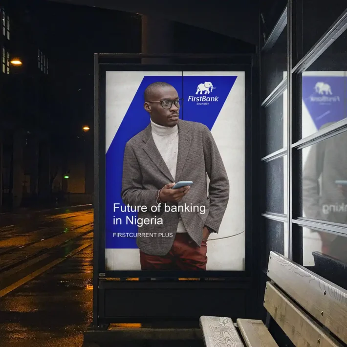
Repositioning of Firstbank Nigeria through a brand evolution, updating colours and simplifying the elephant logo while retaining heritage.
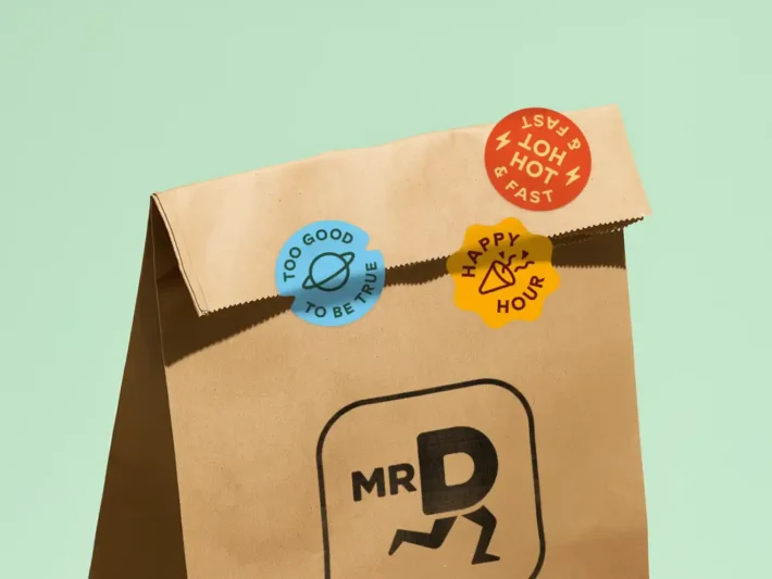
Mr D Branding
Integrated and user-centric Mr D brand refresh from food to convenience with simplified logo, playful illustrations, and bold typography.
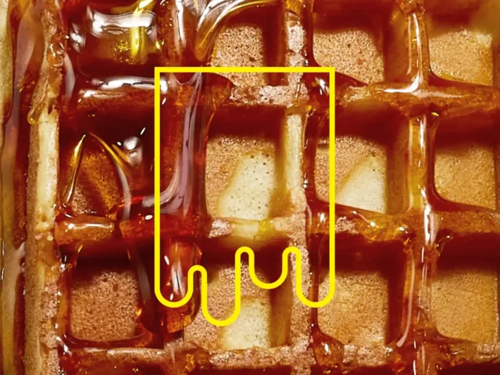
Sticky Waffle Branding
Strategic thinking and design for Sticky Waffle branding, capturing attention with bright yellow, syrup wordmark for a bold, playful feel.
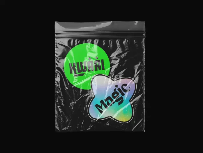
Wordmark Collection
Bespoke wordmark collection exploring unique letterforms, bold and geometric, often evoking concepts through abstract representation.
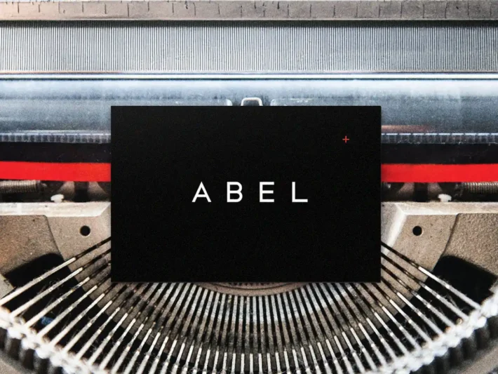
Abel Stationery
Abel stationery design bespoke wordmark, geometric typography, generous white space, and a punch of red for a highly engineered look.
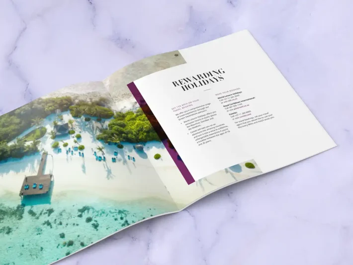
Brochure Selection
Editorial design for corporate reports and marketing brochure selection, pairing clear typography with full-bleed imagery for a premium feel.
